SURCA grants are now open here for faculty. Deadline is March 17 2026.
The CSURF Fellowships Competition is open here for sophomores and juniors (rising juniors and seniors). Deadline is March 24 2026.
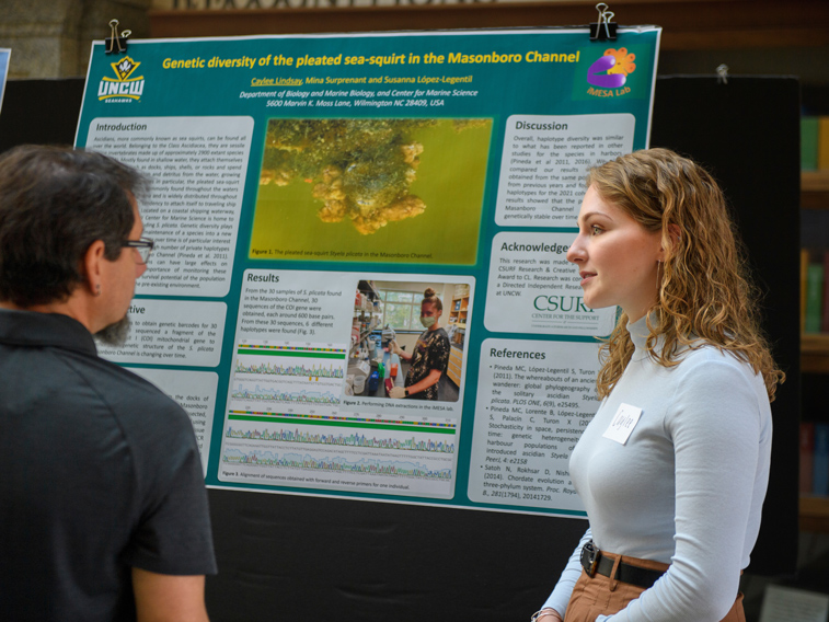
Submit your abstract to reserve your spot at the Spring Showcase of Student Research and Creativity! Abstracts are due here by April 1. The Showcase will be April 25 1-3pm.
Congratulations to Emma Nani, Bryce Settlemier, George Burch, Bailey Milde, Azul Baltazar, and Ethan Smith who were accepted to present their research at the National Conference on Undergraduate Research in Richmond VA. Bryce was also accepted to the Richard Macksey National Undergraduate Humanities Research Symposium in Baltimore MD.
We are excited to welcome Madison, Meghan, Olga, and Laura as undergraduate research ambassadors. They, along with Sofia, Katelyn, Trevin, Alex, Emma, Bryce, Olivia, and Brianna, are working on some exciting projects. You can connect with them through this survey.
Keep up with all of the news on our Instagram!